Veroza
PHOTOSENSITIVE WARNING—CONTAINS FLASHING LIGHTS
Concept:
Veroza is a search engine brand that I have created to address a big issue with search engines today: too much clutter, too many ads, too much clickbait, and AI summaries with questionable accuracy. Veroza gives you vetted information, calculated to be the most helpful and to-the-point.
The work for this project includes the ideation of the brand, complete with the brand ecosystem, a mini-brand guideline document, stationery, and an introductory video.

Part of this project included the creation of the mini-brand guideline PDF.
The video does not use voiceover, instead relying on expressive character and environmental animation to express the painpoints of the user experience with minimal text in a metaphorical narrative, personified by the eye logo.
The eye represents clarity and curiosity, looking directly forward to reflect the direct and immediate answers you will find to your queries. The eye can feel intense—the truth often is. Veroza is built for those who believe that meaningful, trustworthy information is worth seeking.
Veroza is a global brand, the name created to be globally pronounceable and phonetic, maximizing reach and accessibility to do the most good. The ver- prefix draws inspiration from both 'verdant' (growth) and 'veritas' (truth), symbolizing a search engine that helps knowledge grow while guiding users to the truth. -Za as an ending gives the word energy, using a letter that buzzes to not lose the end of the name when said aloud. Many languages also use -a endings to signal femininity, giving a subtle nod to equity over equality.

The eye icon against Veroza green, reinforcing the concept of growth that the user can have using the search engine.
Jobs:
Ideation (Concept, Brand, Ecosystem)
Creative Direction
Animation
Motion Design
Character Design
Visual Design
Narrative Development
Storyboarding
Typography
Audio Mixing
Sound Design
Editing
Composition (Audio + Visual)
Researcher (User, Market)
Optimization
Revision
Process:
Identifying the Problem
This project began with an evaluation of the market and user painpoints in their day-to-day life. The dissemination of unverified information is an issue that I am passionately against, as well as a growing concern that translates into a service.
Further brainstorming led to a larger scope of the brand, going beyond verified information to also remove a lot of the clutter and SEO farming that worsens the average user experience of a search engine. Veroza will use AI to scan websites with an altered SEO, prioritizing cited information and lowering highly commercialized websites that use sensational content to lure in users.
Developing the Brand
Veroza’s brand centers around the idea of disruption—giving the brand a visually distinct identity. I thought about how best to be distinct at every step of the way, and that began with the logo lockup design.
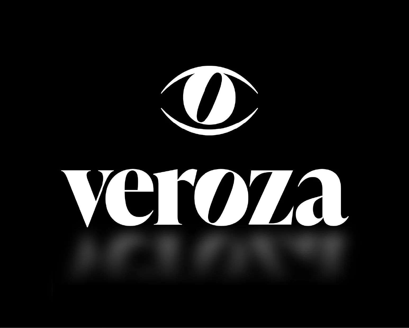
The Veroza lockup, including the eye icon and wordmark, with a stylized reflection underneath.
The typeface I chose was IvyPresto Display, using contrast in stroke thickness and sharp serifs to depart from the modern, sans serif appearance many search engines use. This also gives it a sense of sophistication while being clearly understood. The slanted counter of the ‘O’ acts as a secondary trademark, as well as a visual metaphor—it appears to be rolling to the right, giving the brand a sense of momentum and intentionality, aligned but progressive.
The idea of the eye came quickly following the wordmark, it reuses the slanted-counter ‘O’ as a pupil, literally connecting that progressive focus to an eye. It suggests the ways this brand differs allows users to see clearly, free from noise.
Transitioning to Animation
The colors were created with a heavy emphasis on the message, contrasting all the noise (a stylized rainbow of color) with the clarity of empirical information (black and white). This was the stage where I began to think about the introductory video, using the rainbow as a transition between the black and white to represent the process of looking something up. You begin in a state of calm, all white, then receive a full rainbow of content, leaving you in the dark. Essentially, the rainbow gets controlled and transformed into clarity.
Scripting
The script was created by taking Veroza’s selling point and turning it into a narrative that viewers can relate to and delight in watching. A comical dramatization of the annoying part of looking things up felt like a good way to sell the brand and speak to my strengths and interests as a designer and animator—giving objects a sense of life through subtle secondary and tertiary motion. Giving the eye a personality helps viewers understand the problem better and have more investment in their success, strengthening the message.
Drafting was a slow process, but a sure one. The aim was to have every moment, every color, every transition completely cleared up in my mind. I needed to be able to visualize what I was writing in order to gauge the cohesion and how practical the effect would be. For example, the eye character is not designed to have a back, meaning I cannot show the eye facing away from the viewer. The difference between writing “the eye looks at text and reads it” and “the eye sits on the same plane as the text, looking up to read it” makes all the difference, and makes staging much easier later on.

Drafting included an extensive process of ensuring every action was thought out and was clear in my mind.
This was also the stage where I searched for music to put in the video. I personally believe in finding music and audio elements earlier on in the process than most, as the music you can find and use should be as cohesive with the final product as possible. The best way to ensure that is by creating the work while immersing yourself in the music you have found. How can you connect your idea to the actual audial qualities of what you hear?
Storyboarding
The next step in my process was creating the storyboards. I created these digitally in Adobe Illustrator so that I could copy and paste assets from the scene that I wanted to export into Adobe After Effects. Some objects that required more manipulation were recreated in After Effects, using PNG exports of those assets to ensure they are perfectly replicated.

Storyboarding was created using assets that could be exported individually into After Effects, being cut out of frame in places but kept intact to allow for future flexibility as needed.
The next step in my process was creating the storyboards. I created these digitally in Adobe Illustrator so that I could copy and paste assets from the scene that I wanted to export into Adobe After Effects. Some objects that required more manipulation were recreated in After Effects, using PNG exports of those assets to ensure they were perfectly replicated.


Asset exporting required extensive planning and anticipation of the kinds of motion and distortion that would need to be applied to each element. These two written pages list most of the assets, categorized by scene and marked with where the anchor points need to be, as well as what precomps they need to be put in for the desired manipulation in animation.
Animating
The last step to finish this project was the actual animation. This began with recreating the eye using tools within After Effects to allow for maximum flexibility. The echo effect was used on the pupil and counter to distort the shape of the pupil to mimick motion blur.


The pupil and counter utilized the echo effect in After Effects to simulate motion blur, creating a cascading trail of copies.
Once I was happy with the build of the eye, the assets and PNGs were imported and organized again by composition and the scene(s) they are in.
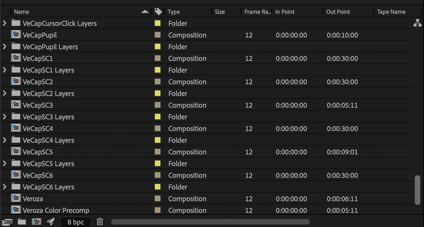
Every asset was imported within folders, then placed into compositions for each scene with sub-compositions for each set of assets that require secondary animation within a larger group.
Scene animation began by setting the anchor points for every asset (per the planning document), and placing the assets exactly in the same positions as the storyboards. From here, much of the process was transitioning the objects from one scene to the next. This was a very labor-intensive process, but also one that brought me a lot of joy because I was discovering new tools and effects at every turn. This boosted my confidence, but more importantly gave me more methods to manipulate assets in earlier scenes—there was a lot of backtracking to ensure cohesion across the video.

Assets were placed individually to return to the positions determined in the storyboarding. These positions were not always kept through to the final version, but it gave me a very solid foundation for the animation and transitioning scenes.
Much of the time spent animating was in the graph editor—movement was meant to be snappy with a slight ease at the beginning and end, so many of the keyframed positions have influence between 80–100% depending on the period of the action. This kind of easing was chosen because it wastes no time in an undesired position, representing the input and output of a search with no time wasted trying to find what you are looking for.

The After Effects graph editor was essential to finessing the easings of the actions, emphasizing contrasting speeds to be cohesive with messaging and the form of the typography (contrasting stroke thickness).
Post-Animation
After the animation was finished, it was on to a process of adding sound effects and reworking moments of the animation to best reflect those sounds. The animation was played for peers, who gave helpful input and resulted in a second round of tweaking everything until it ended up in the form that I would consider the most successful. The animation concludes with the lockup, the first asset I had created for the brand, to bring the entire narrative to a close and tie it in to the very foundation of the whole project.