Personal Logo Animation
Concept:
My personal branding went through a revision in Summer ‘25, resulting in a new logo that better aligns with my style and value as a designer. With this rebranding comes this animation, bringing the new logo to life to show a variety of animation styles, and further emphasize the meaning behind the icon itself.
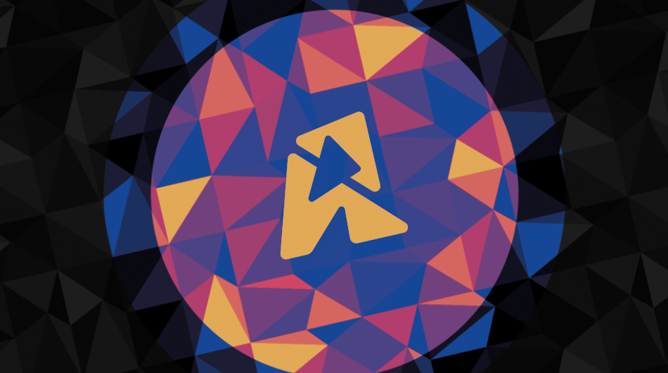
My tagline, ‘shaping the abstract,” begins with an abstract visual, three triangles here, and is manipulated to create meaning in the form of a stylized ‘R’ with depth and a range of color. The icon and its motion suggest that abstract concepts can be communicated simply through subtle but effective motion.
Process:
The logo was created with potential for motion in mind—it features a dynamic angle with shading, almost like a moment frozen in time. The concept of abstraction coming together into something concrete translated directly here— decomposing the icon into its segments to combine illustrates the concept.
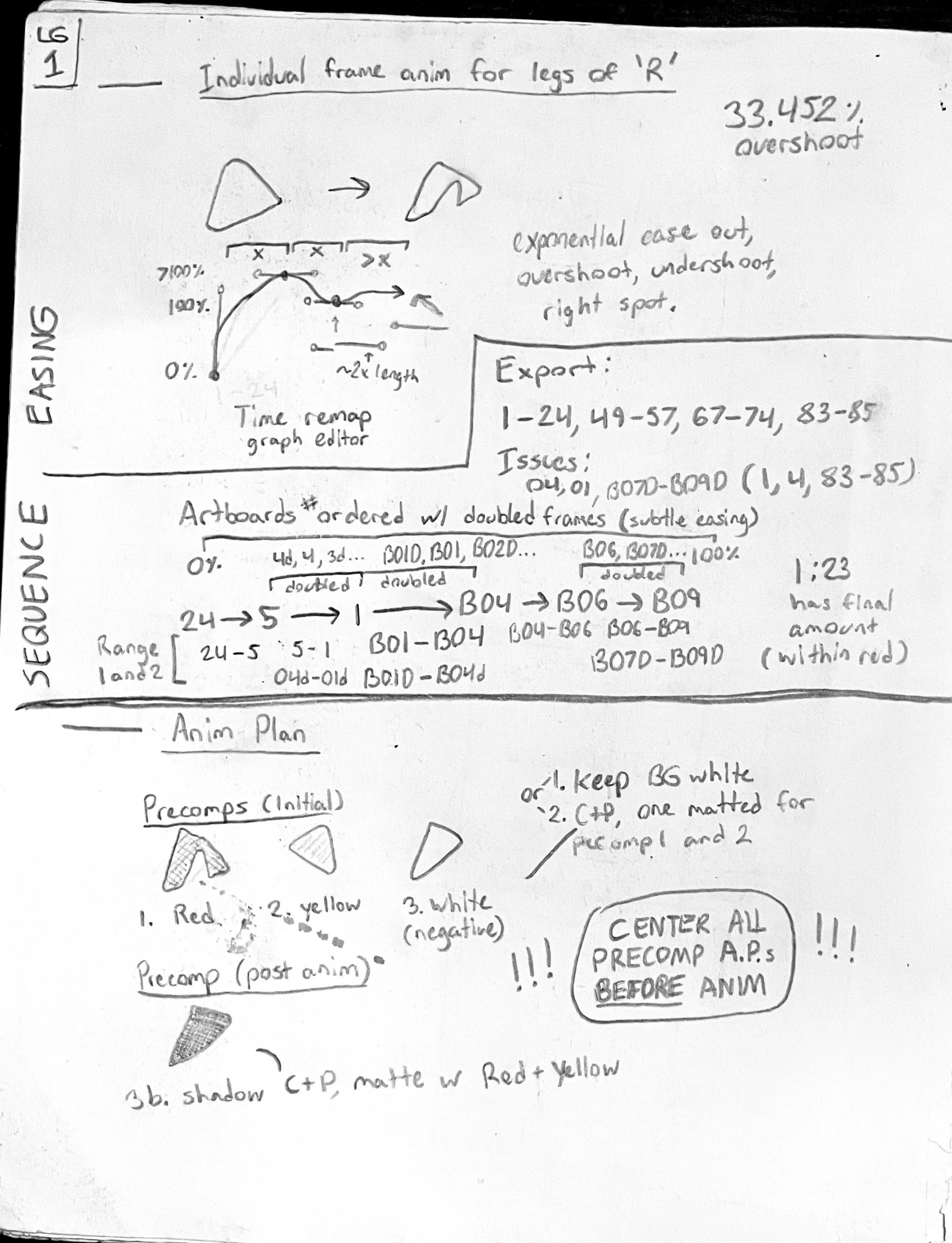
The negative space in the center of the icon was easy enough to convert to a white triangle to animate as positive space, however, the counter between the legs proved to be more of a challenge, as it requires consistent corner rounding as the width changes. The solution I found was to manually create the frames I would need one-by-one, offsetting the movement in consistent increments to create linear motion. Frames were doubled up for the three moments of the animation where the movement slows to a stop to allow for smoother motion. Tthis process was long and required quite a bit to be written down.
Jobs:
Ideation (Concept, Brand, Ecosystem)
Creative Direction
Animation
Motion Design
Visual Design
Typography
Editing
Optimization
Revision


The frame-by-frame animation contains 44 frames, separated into even increments ranging from 0–120% of the icon’s distance to allow for an overshoot.
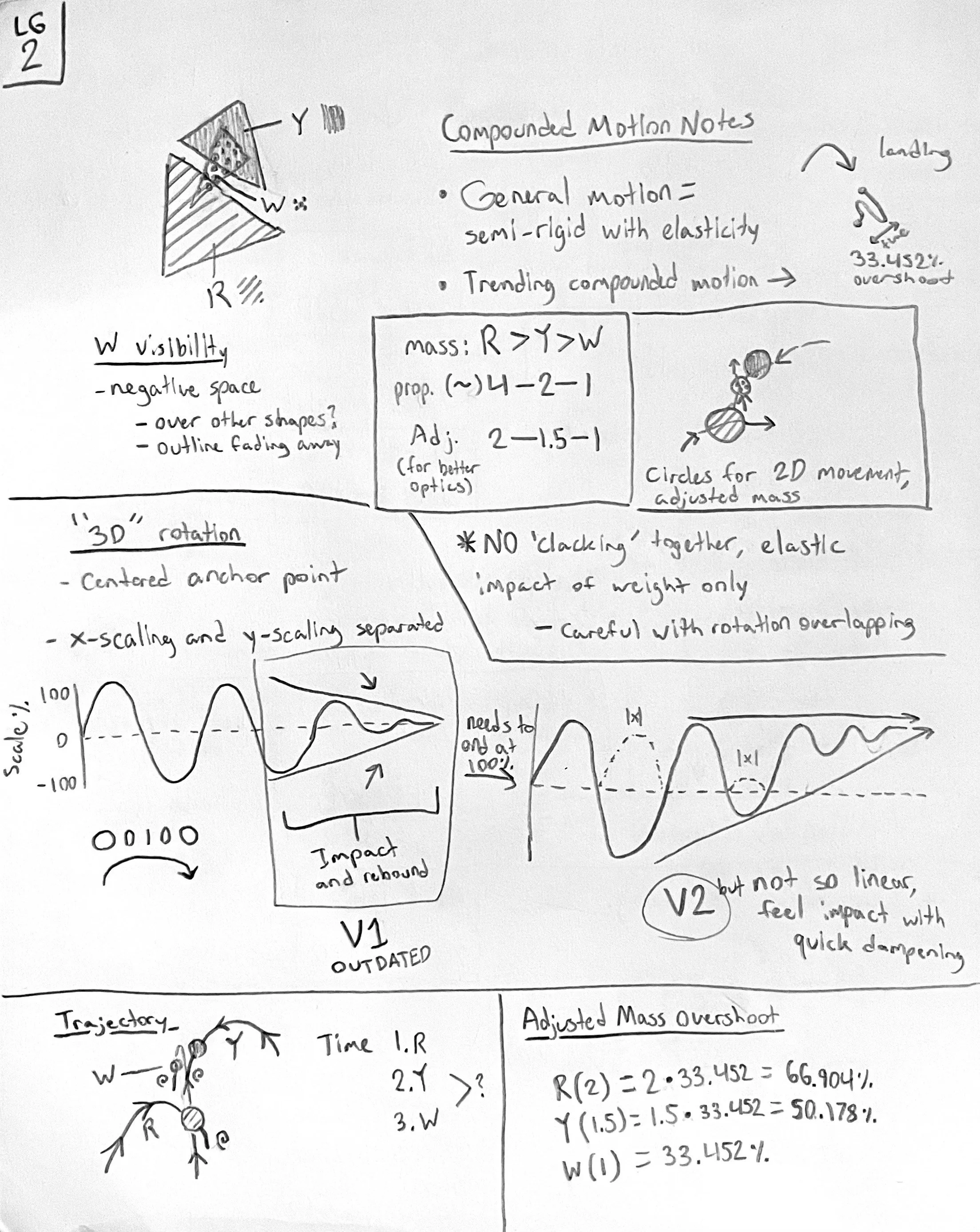
A lot of the finer detail came about as a means to expand on the depth the logo’s shadow suggests. Gradients of analogous colors combine with X and Y scaling to suggest a light source overhead and a set of planes in 3-dimensional space, when they were in fact created in 2D.


Darker (closer to purple) colors suggest less direct light from overhead, while lighter (closer to yellow) colors suggest the shapes are angled upward.
Calculating the movement of the sections began with several estimations, including the perceived weight of the pieces and the graphs that needed to be made. The biggest of these graph concerns was how well depth can be communicated in 2D animation, using X and Y scaling to distort was first planned on paper, then translated to After Effects. Many of my calculations offered a useful framework, however, many of them also needed further adjustment to account for perceived cleanliness and fluidity.

Notes and sketches helped organize my thoughts, making the pieces clearly have depth required a lot of nebulous thinking. This project has helped me quite a bit at organizing my thoughts and being able to record enough of my thoughts that I can return later and get caught up with ease.
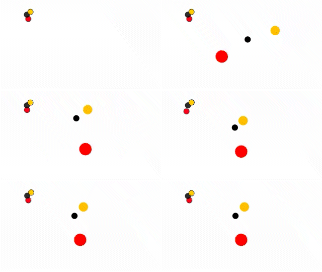
The motion of the pieces coming together began with a set of three dots, to have the positions of the pieces parented to. Secondary animation was included by adding the delta position of the smaller circles to the parented position from the larger ones.

The center dots are for the pieces to be parented to for their primary motion, with the addition of the second set for secondary animation (bounceback).
After some finesse, the second part of the animation began—featuring a prominent pattern in my revised branding. I had the idea to cycle between the six colors of the brand every few frames to add energy, so I created six frames with each combination of the color scheme.

The six colors in my branding were cycled to create six unique colorings of this pattern.
The pattern sequence, after some revision, ended up monochrome with very low contrast to add a slight texture.
However, I missed the color, and wanted to find a way to reincorporate it. I ultimately settled on two scaling masks with a toner effect to remap the range of colors into the brighter and darker halves of the color palette.

Colors were included through masks that separated the palette into the brighter and darker half.
To reinforce the motif of quick, snappy movement that happens in the transition, the latter transitions out for both the logo and the text were both made with a high ratio of anticipation time to movement time. Once these transitions were polished, the final animation was ready to go.
Created using Adobe After Effects and Adobe Illustrator.